Vancouver 2010 pictograms
March 1, 2010

Pictograms have been part of the Olympics lexicon since Otl Eicher’s successful graphics solidified the trend at the 1972 Munich games. Here’s the latest set of Olympic pictograms from Vancouver 2010. Best served cold.
Wipe away the confusion
June 30, 2008

Great communication by Shaz Madani to promote London’s M25 motorway. On one side the poster gives exact directions that would have to be taken in order to travel from one side of London to the other, illustrating the complexity and confusion involved in taking alternative routes through the center of the city. The reverse side reads: “wipe away the confusion take the M25”.
Gerd Arntz web archive
May 31, 2008

The official fan site… here’s a brief description from the colophon:
This informative and educational website is initiated by the Ontwerpwerk design bureau in close cooperation with Peter Arntz, son of Gerd Arntz, and the Municipal Museum of The Hague, administrator of the Gerd Arntz archive.
Fun with Stroop
April 30, 2008
The Stroop Effect is often used to demonstrate the nature of automatic processing versus conscious visual control. It also illustrates our ability to quickly recognize word shapes based on familiarity, even more quickly than color.
This effect was first described by J. Ridley Stroop in 1935, and was demonstrated by giving participants lists of words printed in various colors of ink. The participants were instructed to name the color of the ink for each word as quickly as they could.
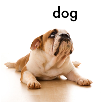
Control condition
In Stroop’s original study, the control condition consisted of neutral, non-color related words (for example, the word “dog” appeared in green ink and “chair” in blue ink).
Compatible condition
Next, the compatible condition consisted of a list of colors – the words red, green, blue, etc. – printed in their corresponding ink colors (“red” was printed in red ink, “blue” in blue ink, and so on).
Incompatible condition
The final list consisted of the names of colors written in different colored ink (for example, the word “red” appeared in green ink).
Stroop found that people could name the color of the ink faster in the compatible condition (“red” in red ink) than the control condition (“dog” in green ink). However in the incompatible condition, people took longer to name the color of the ink (“red” in green ink) than in the control condition (“dog” in green ink). One explanation is that naming the color of the ink is an unfamiliar task to most people and requires conscious effort, while reading is so well practiced that it becomes automatic. So, in the third condition people experience interference – as they try to name the color of the ink, they have already read the word (for example, “red”) and need to consciously adjust their answer.
Try Stroop’s experiment for yourself and see if it takes longer to complete list number 3. Remember, for each group you’re trying to say the color of the words.

Context and expectations
March 30, 2008

A classic example of the importance of context in pattern recognition. Although the central character is the same when viewed inline either vertically or horizontally, its meaning differs depending on contextual cues from its surroundings.
a history of the stick figure
February 7, 2008
Video of my talk, “a history of the stick figure” at Ignite Portland 2, February 5, 2008 at the Bagdad theatre.
Here are a few resources from the talk:
ISOTYPE charts by Otto Neurath
Stick figures as numbers. Three ISOTYPE charts shown as examples.
AIGA Symbol Signs
The complete set of 50 passenger/pedestrian symbols developed by AIGA, available in EPS and GIF formats. Download your own bathroom guy!
Manual on Uniform Traffic Control Devices
Every road sign imaginable is here. The manual defines the standards used by road managers to install and maintain traffic control devices on all streets and highways. Available for download as PDF.
Stick Figures in Peril
Flickr group of warning signs showing stick figures in dangerous, often life-threatening, situations. A must see.
A Year in Iraq
New York Times article and chart in ISOTYPE style by Alicia Cheng.
Many thanks to linuxaid for shooting and posting all of the presentations.
Thanks Portland!
February 6, 2008

I had a great time presenting “a history of the stick figure” at Igntite Portland 2! Thanks to everyone for the great feedback. I’ll post reference material from the talk over the next couple of days, so check back for updates or feel free to email me.
Presenting at Ignite Portland 2
January 22, 2008

I’ll be presenting “a history of the stick figure” at Ignite Portland 2, Tuesday February 5th at the Bagdad Theatre. Doors open at 5:15.
You see him everywhere – hanging around bathrooms, loitering at construction sites, and perpetually crossing the street. The ubiquitous stick figure. That little, iconic, round-headed fellow on signs that makes us think twice before taking the wrong door, or helps us so we don’t really need to think at all. But where did he come from?
We’ll take a look at the origins of the stick figure from post-WWI Vienna to his current status as a cultural icon. It’s a fascinating tale of war, industry, society, and the development of a visual symbol that has evolved to represent all of us.
The stick figure’s tailor
December 11, 2007

Gerd Arntz, Dec 11, 1900 – 1988, was the lead designer of Otto Neurath’s ISOTYPE Institute (the International System of Typographic Picture Education, 1936-1945). The Institute used “speaking signs” to visually convey complex statistical information, and made it accessible to the general public through museum installations and printed publications.
It would be fair to credit Neurath with the invention of the modern “stick figure” as seen in today’s street crossings, rest rooms and construction signs, as he was the first to develop a method of using the human form as a surrogate representation for statistical information. But if Neurath was indeed the father, Arntz was the stick man’s tailor. Under Arntz’s influence, early naturalistic representations gave way to flat, less individual and more abstract designs, eventually becoming the elements of a visual dictionary.
Design features of language
November 27, 2007
Language is a complex skill that allows people to communicate an enormous number of messages using arbitrary symbols. Although some would argue that the use of language is central to defining humanity, the term “language” itself can be somewhat difficult to define.
Linguistic theorist Charles Hockett described sixteen design characteristics which he believed were central to human language. Some of the more important characteristics are displacement, arbitrariness, semanticity, and productivity.
Displacement is the ability to use language to discuss things removed in space and time (for instance, you could talk about events that happened last month in Finland).
Arbitraryness refers to the symbolic nature of language. The sounds, symbols, or signs we use to represent ideas or objects are completely arbitrary (for instance, the word “dog” doesn’t sound like a dog or look like a dog when written, it just represents a dog).
Semanticity is the meaning we then assign to these arbitrary symbols. Words and pictures have shared meaning that communicate ideas between people.
Productivity describes the creativity of language. We can create and understand a vast number of unique sentences because we can combine and recombine words using an agreed upon system of rules. For example, “the dog is melting quietly in the boardroom” is a weird statement, but since it’s structured as a sentence its meaning is clearly understood. If asked, most people would be able to describe exactly what it is the dog is doing.
